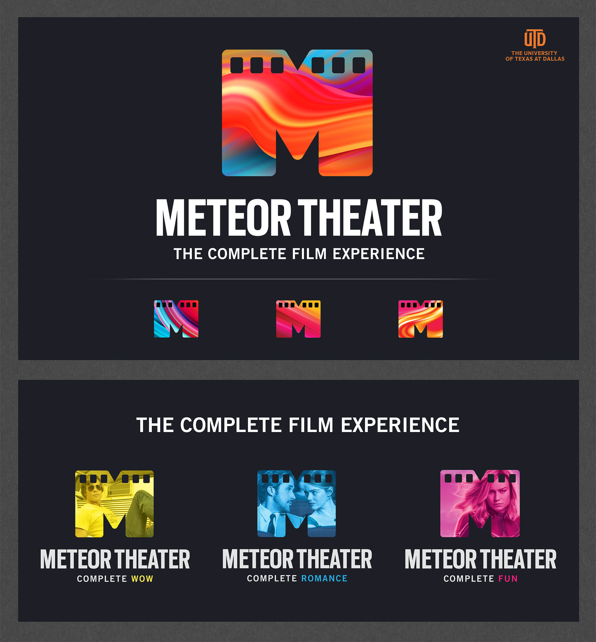

My daughter went to UTD and worked in the Meteor Theater department, where a group of students was challenged with running every aspect of operations and marketing. When the idea to rebrand the department came up, they came to me—because I'm wildly talented—and I agreed to do it for FREE.
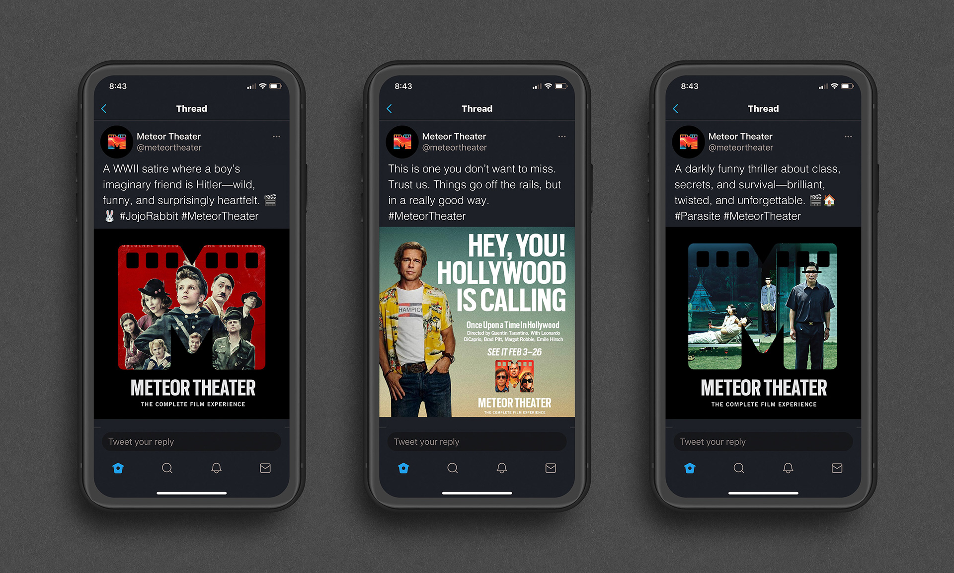
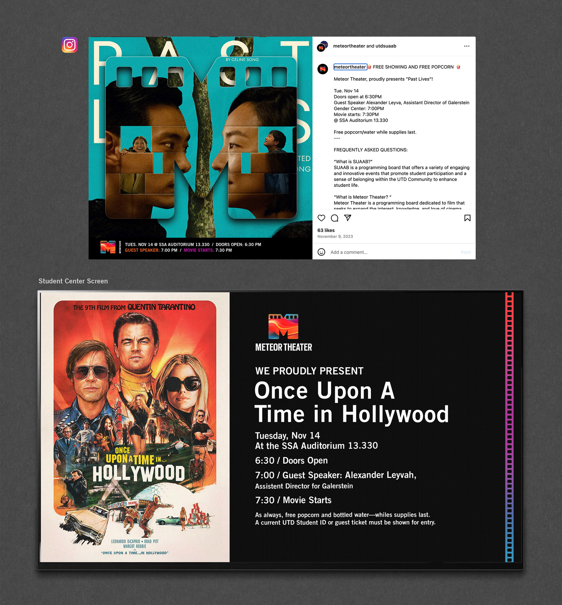
This look incorporates elements of their school symbol, the comet. The vivid, flowing colors allow for a variety and motion within the primary logo mark. The large, filmstrip-shaped "M" also makes the perfect container for imagery to convey any visual story.
Ok, dim the lights.